Brief
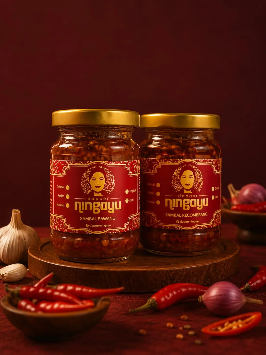
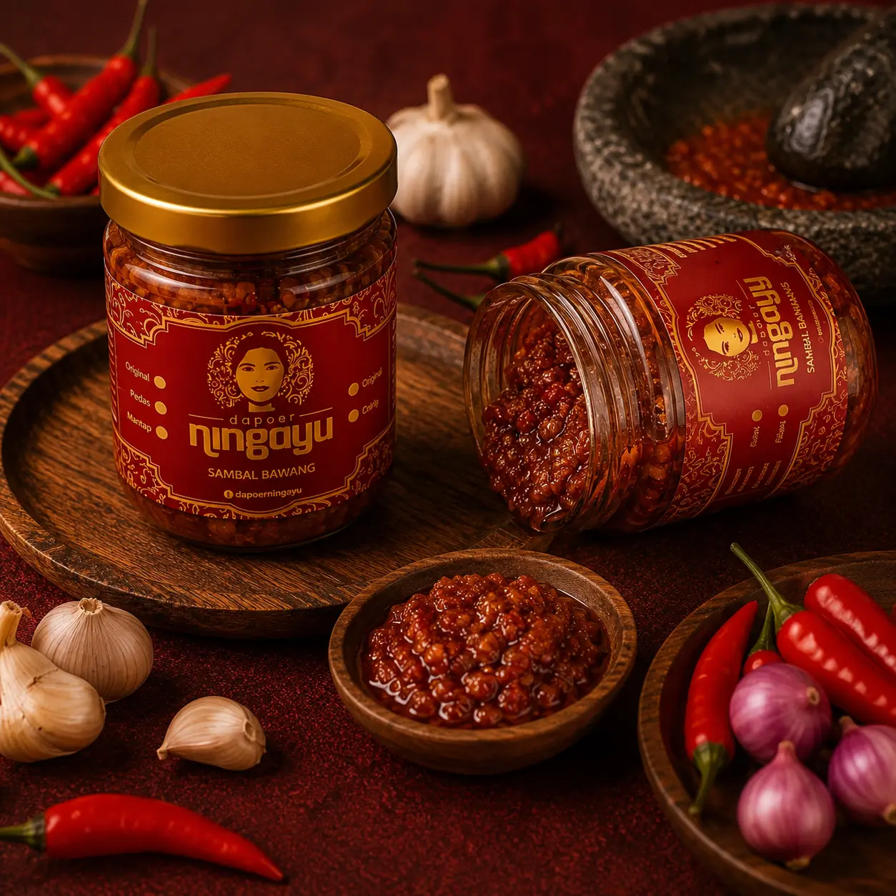
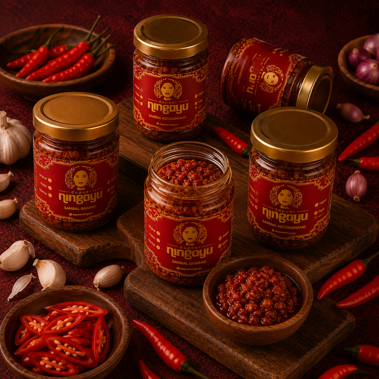
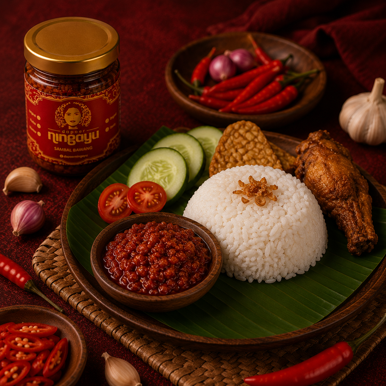
Complete brand identity refresh — logo, colour palette, typography, and brand guidelines — for a nusantara sambal brand built on a family recipe. As the product grew from home kitchen to wider retail, the identity hadn't kept pace: labels, packaging, and social content varied from batch to batch, with nothing to keep the look consistent.
Approach
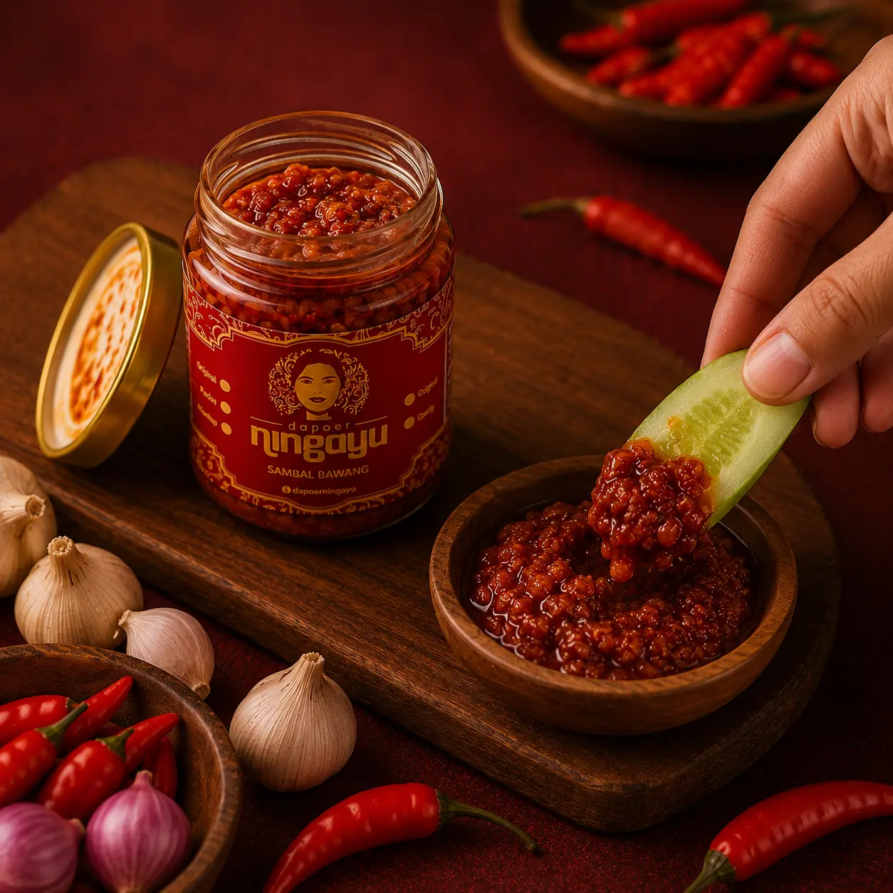
The family recipe is the anchor — one sambal standard that hasn't shifted since Ning Ayu first bottled it in her kitchen. Every jar we produce has to hit that same taste, from the first batch we seal to the last bottle someone opens at home. That consistency is what turns a customer into a repeat buyer, and a sambal into a pantry staple.
Result
The refreshed identity gave the sambal a distinct, recognisable presence on a crowded shelf and across marketplace listings — sharpening recall whether customers spotted the jar in a local store or scrolled past it online.
GET STARTED
We work with F&B brands that want content with personality — not templates. Tell us what you make. We'll tell you how we'd make people notice.
PT Incbuss Makmur Sejahtera
© 2026 Incbuss Creative. All rights reserved.