Brief
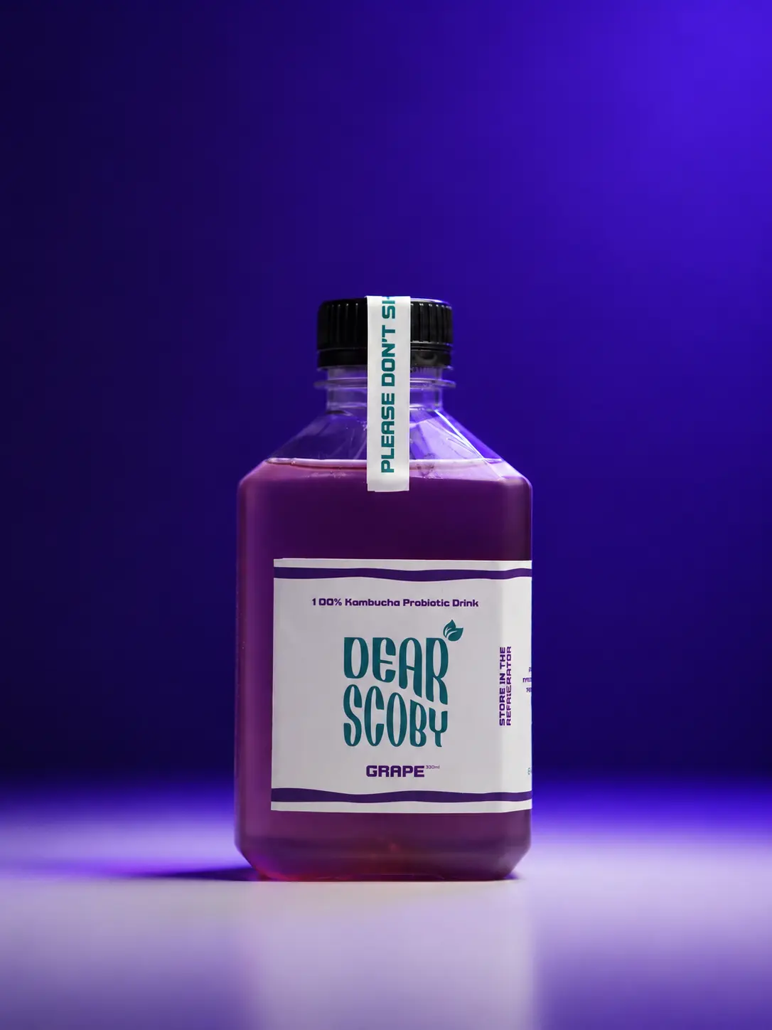
Dear Scoby needed packaging that could hold its own on a crowded shelf — distinct enough to stand out, but still clearly premium and trustworthy enough to pick up.
Approach
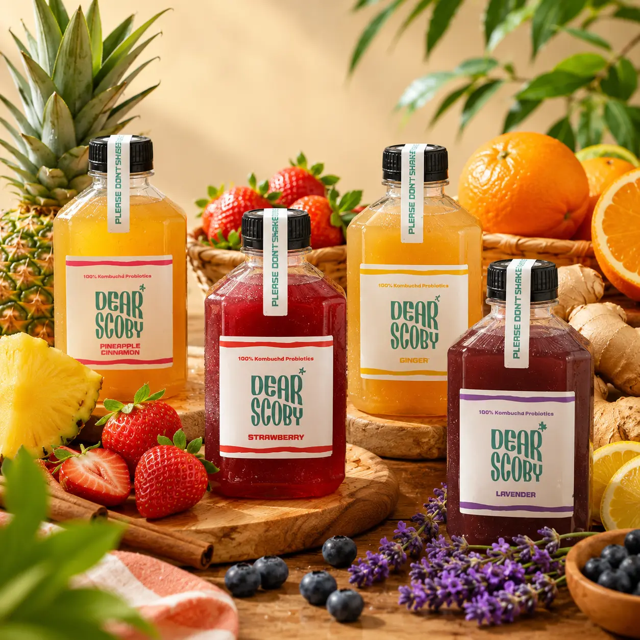
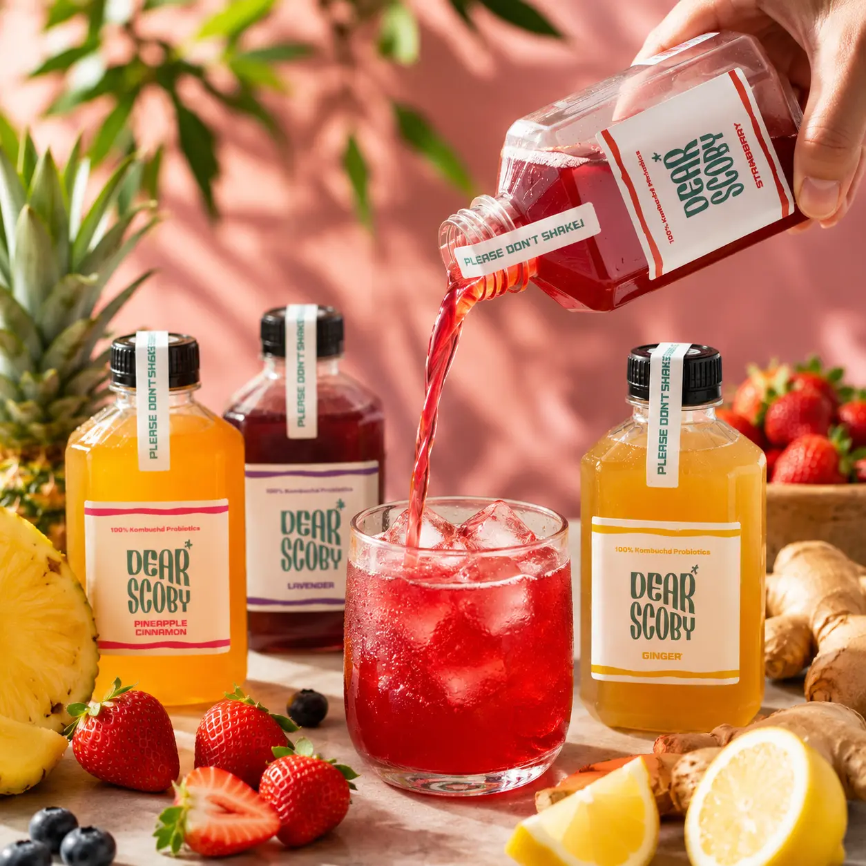
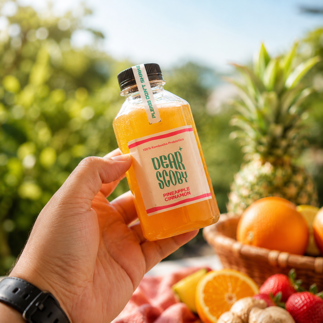
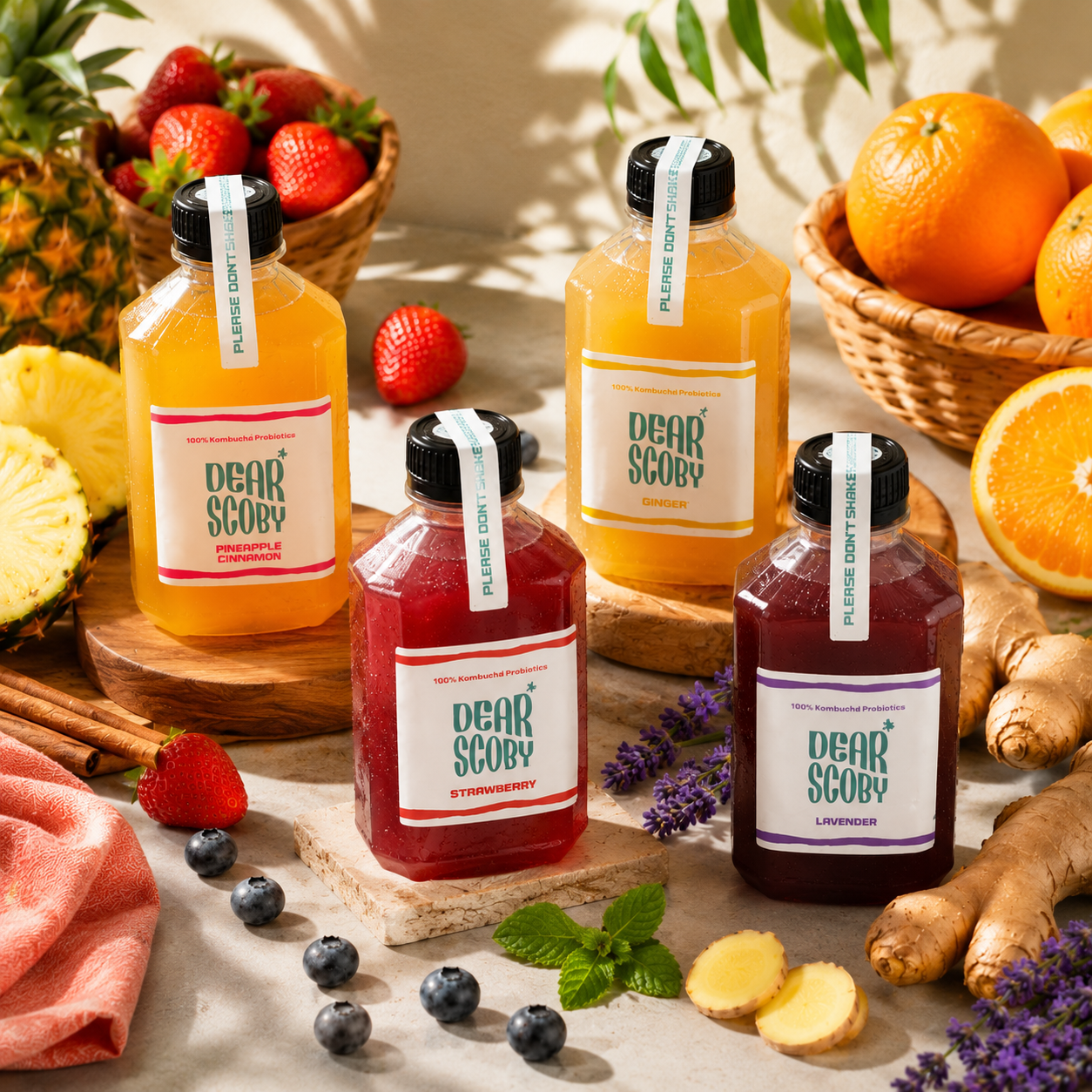
We developed a packaging system built around a clear visual hierarchy — flavour, format, and brand mark each get their own space — so the design reads clearly whether it's sitting on a shelf or in a product photo.
Result
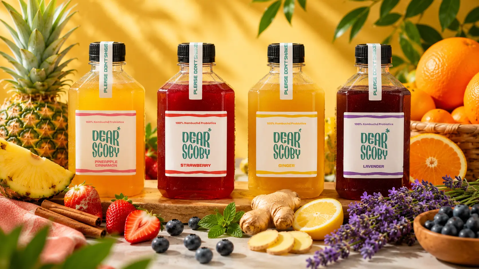
The new packaging gave Dear Scoby a distinct, consistent shelf presence and a visual identity the brand can extend cleanly across future flavours and formats.
GET STARTED
We work with F&B brands that want content with personality — not templates. Tell us what you make. We'll tell you how we'd make people notice.
PT Incbuss Makmur Sejahtera
© 2026 Incbuss Creative. All rights reserved.